Loyalty Programme
Loyalty Programme
Overview
The client is a fintech start‑up bringing face‑recognition payments to physical retail. Customers set up a biometric profile and link their card once, and from then on they can pay at the counter just by looking at the terminal, with no card, phone or PIN needed. Working with established banking partners, the company is rolling the technology out across a growing network of shops and retail chains. Its promise is simple: a checkout that is faster than paying by card or phone and just as secure, backed by encryption, tokenised card payments and liveness detection that can tell a real face apart from a photo or video.
Client
Stan.Vision
Year
2025
Services
Mobile & Tablet Design

MY ROLE
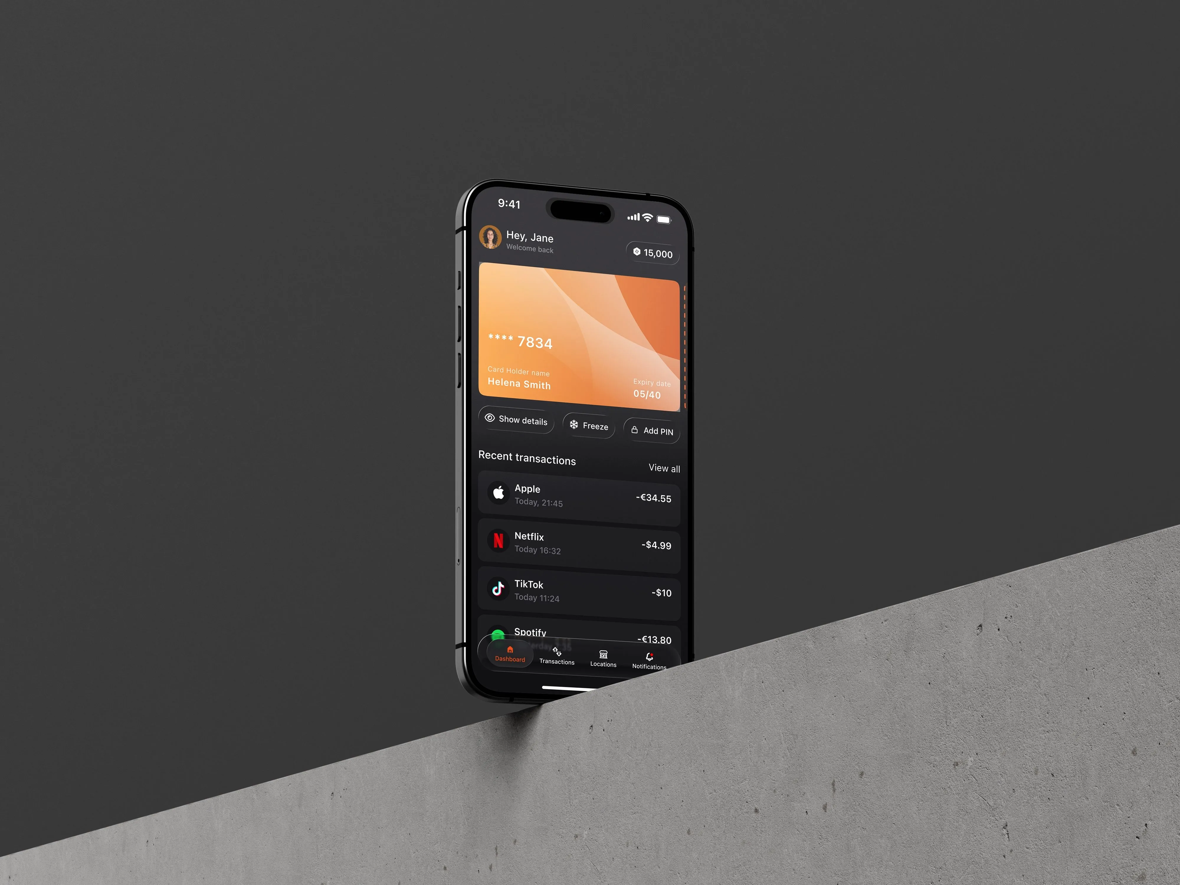
As a Senior Designer, I joined the project midway and took ownership of the loyalty programme, designing it end to end across the customer mobile app and the merchant tablet.
This meant getting up to speed quickly with the existing product, its design language and the decisions already made, then shaping the loyalty experience so it felt like a natural part of the platform rather than an add‑on. The work covered every loyalty touchpoint, from finding participating stores in the app to accepting points at the checkout.
STORE MAP & LIST
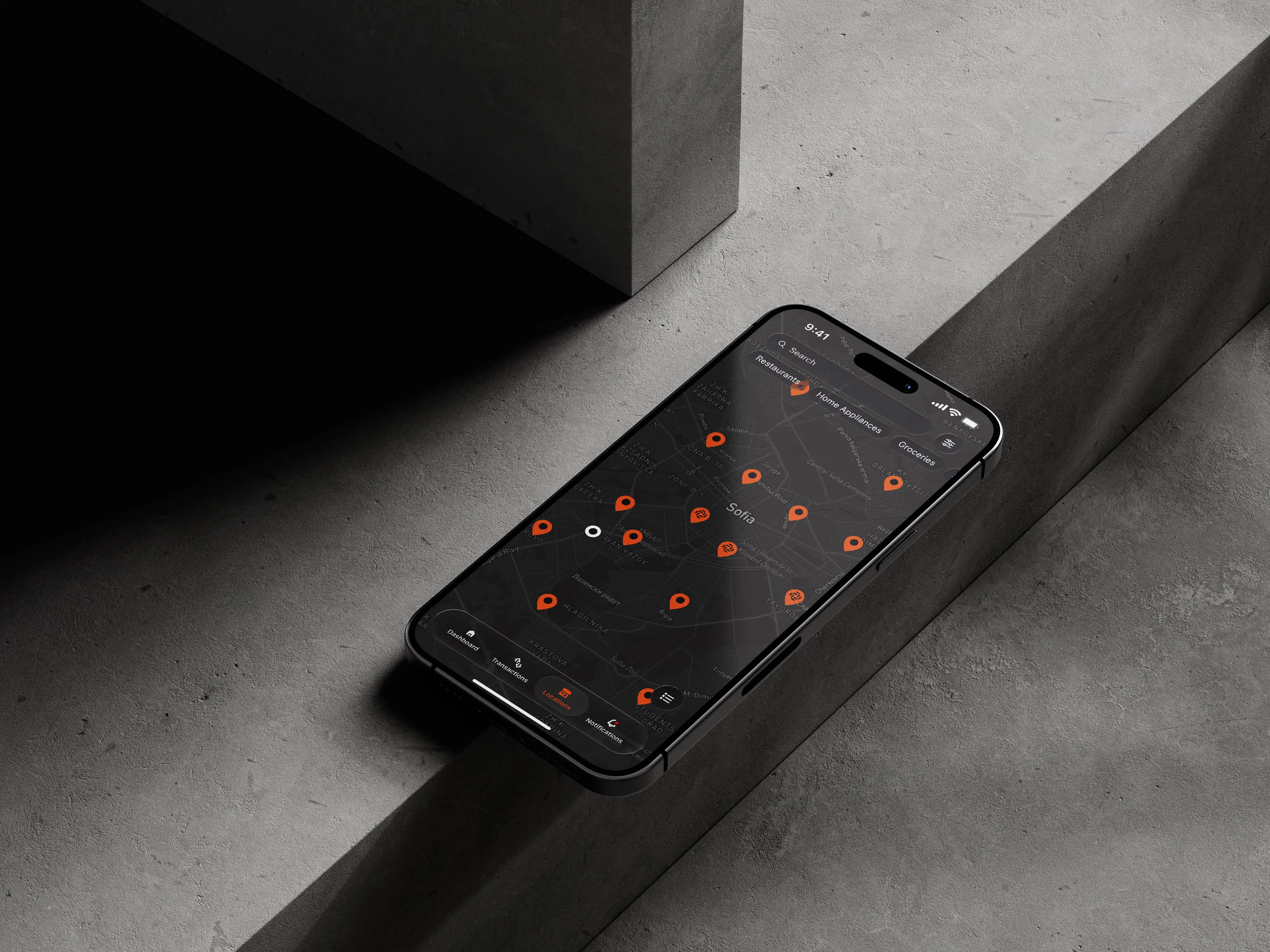
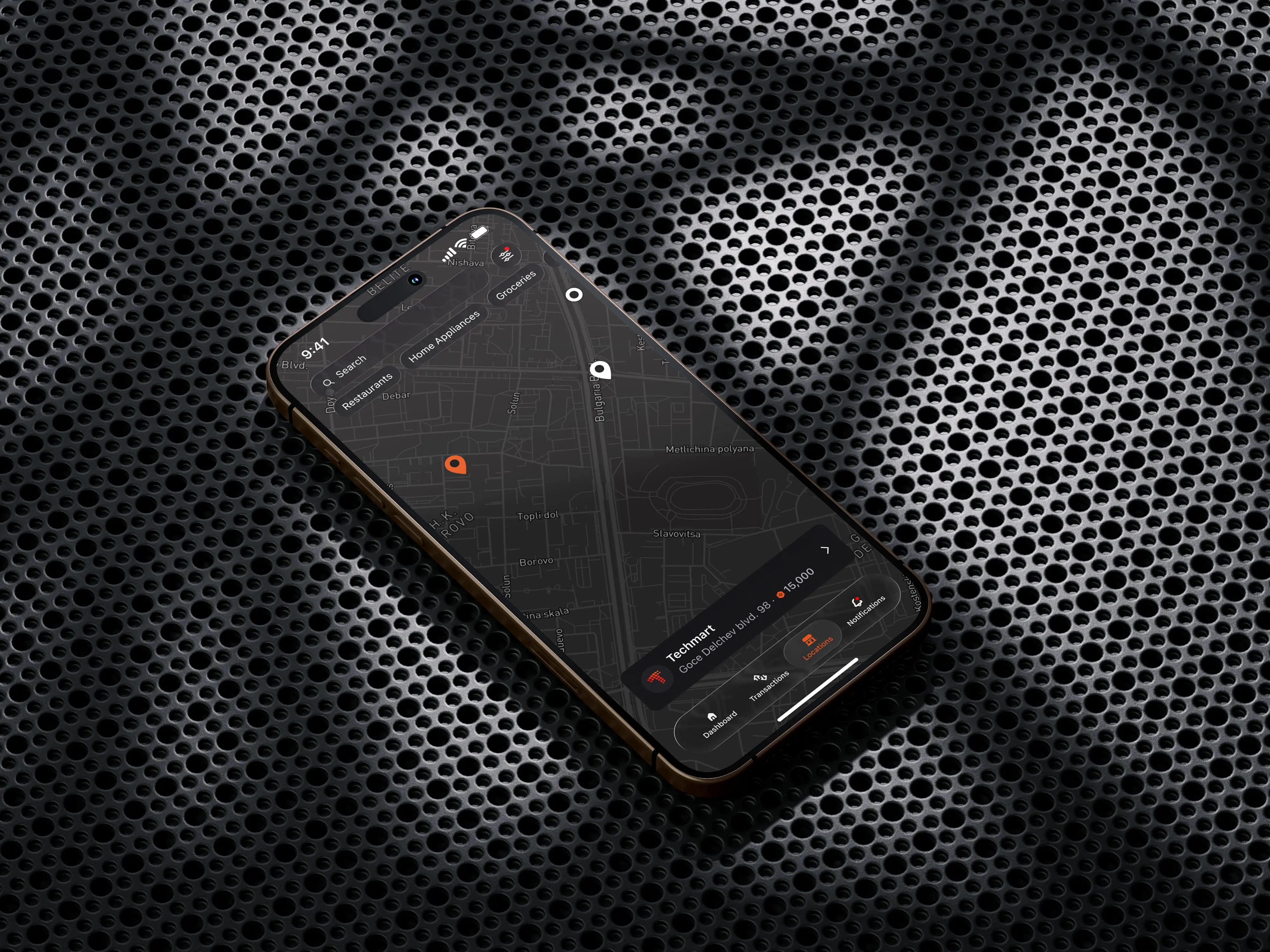
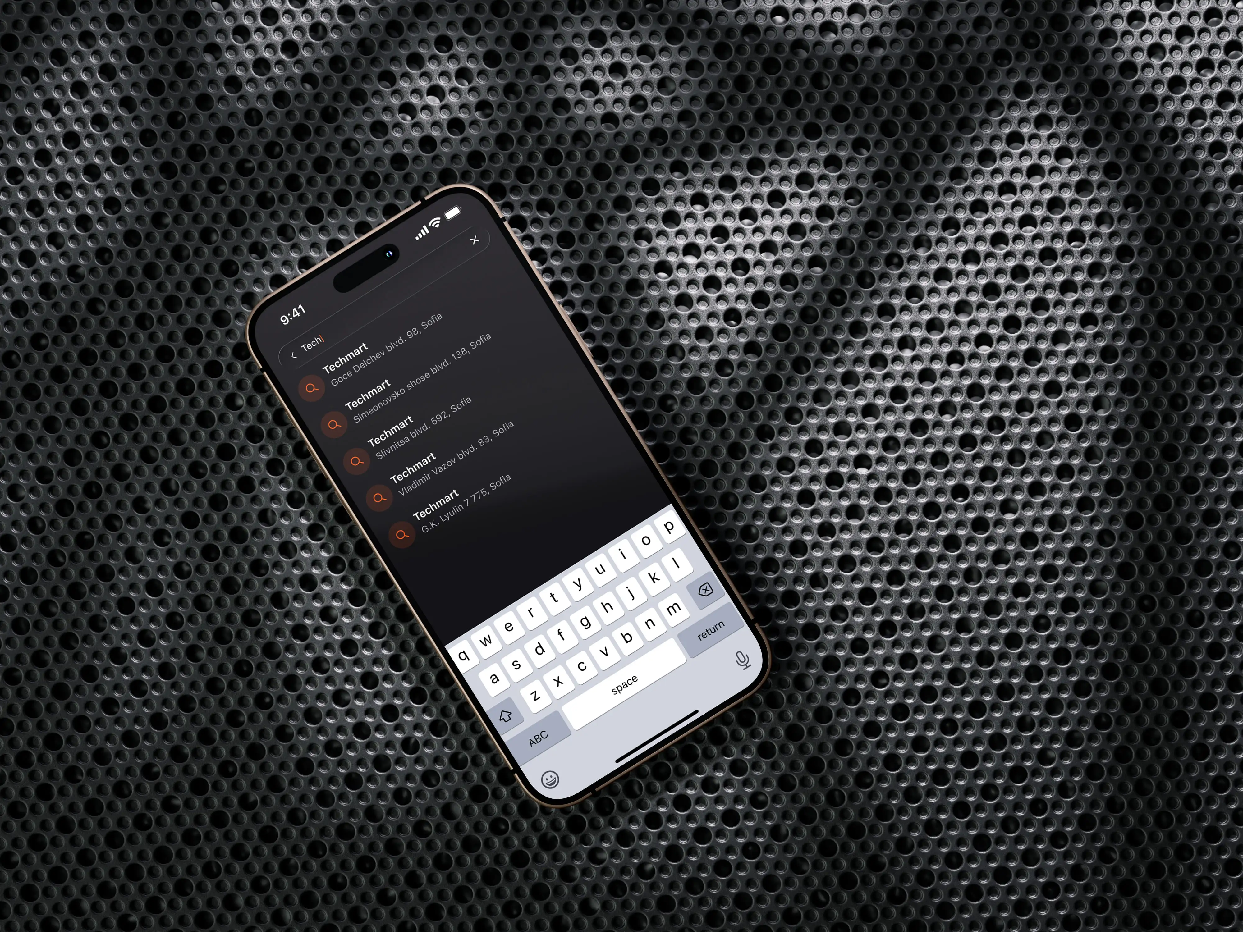
Customers can browse participating stores on a map or in a list and switch between the two with a single tap. The map shows at a glance where points can be spent nearby, with a quick preview when a store's pin is tapped, while the list presents the same stores as scannable cards for customers who would rather browse than navigate.
Filters help customers narrow the results down to what they care about, such as a certain type of store or promotion. The same filters apply to both views and stay clearly visible when active, so customers always understand what they're seeing and can move between map and list without starting their search again.
STORE PAGE
Each participating store has its own page that brings everything a customer needs into one place: a description of the store, the types of promotions available to loyalty members, and its location. Tapping the location opens the navigation app of the customer's choice, such as Google Maps, Apple Maps or Waze, instead of forcing a single provider or rebuilding directions inside the app.
Every promotion also comes with mandatory terms and conditions. These sit at the end of the page, clearly labelled and easy to find, so the programme stays transparent and compliant without legal text burying the offer. The result is a page customers can scan in seconds before deciding to visit.
TABLET CHECKOUT
The merchant tablet is run by staff, who set up each payment request, while the customer's only job is to look at the camera so their face can be recognised. The design had to serve two people at once: a staff member working quickly through a queue, and a customer who needs to trust what's happening without touching anything.
Large touch targets, a clear hierarchy and high‑contrast states keep the right action obvious at a busy counter. Each step shows only what's needed at that moment, so the flow from payment request to face recognition to confirmation stays short and predictable, and staff can use it confidently from day one.
PAYING WITH POINTS
Customers can pay in three ways: cash only, where the full amount is charged to their linked card through face recognition, a combination of cash and points, or fully with points. Staff select the option the customer asks for as part of the payment request, so using points never requires a separate process or manual calculations at the till.
Splitting a payment is the most complex case, so the design shows the available points and their value, how much of the total they cover, and the remaining amount charged to the card, updating as the split changes. When paying fully with points, the tablet shows exactly how many points the purchase will use, and a clear success state with the updated balance makes the transaction feel as reliable as any other payment.
THE RESULT
The loyalty programme is now live. Customers earn points through their everyday face payments, find where to spend them on a map or in a list, and redeem them at participating stores, where staff can accept points in just a few taps.
By turning every face payment into progress towards a reward, the programme gives customers another reason to keep using the platform and gives merchants a tool to bring them back, which is exactly what a new way of paying needs in order to grow.

Overview
The client is a fintech start‑up bringing face‑recognition payments to physical retail. Customers set up a biometric profile and link their card once, and from then on they can pay at the counter just by looking at the terminal, with no card, phone or PIN needed. Working with established banking partners, the company is rolling the technology out across a growing network of shops and retail chains. Its promise is simple: a checkout that is faster than paying by card or phone and just as secure, backed by encryption, tokenised card payments and liveness detection that can tell a real face apart from a photo or video.
Client
Stan.Vision
Year
2025
Services
Mobile & Tablet Design
MY ROLE
As a Senior Designer, I joined the project midway and took ownership of the loyalty programme, designing it end to end across the customer mobile app and the merchant tablet.
This meant getting up to speed quickly with the existing product, its design language and the decisions already made, then shaping the loyalty experience so it felt like a natural part of the platform rather than an add‑on. The work covered every loyalty touchpoint, from finding participating stores in the app to accepting points at the checkout.
STORE MAP & LIST
Customers can browse participating stores on a map or in a list and switch between the two with a single tap. The map shows at a glance where points can be spent nearby, with a quick preview when a store's pin is tapped, while the list presents the same stores as scannable cards for customers who would rather browse than navigate.
Filters help customers narrow the results down to what they care about, such as a certain type of store or promotion. The same filters apply to both views and stay clearly visible when active, so customers always understand what they're seeing and can move between map and list without starting their search again.
STORE PAGE
Each participating store has its own page that brings everything a customer needs into one place: a description of the store, the types of promotions available to loyalty members, and its location. Tapping the location opens the navigation app of the customer's choice, such as Google Maps, Apple Maps or Waze, instead of forcing a single provider or rebuilding directions inside the app.
Every promotion also comes with mandatory terms and conditions. These sit at the end of the page, clearly labelled and easy to find, so the programme stays transparent and compliant without legal text burying the offer. The result is a page customers can scan in seconds before deciding to visit.
TABLET CHECKOUT
The merchant tablet is run by staff, who set up each payment request, while the customer's only job is to look at the camera so their face can be recognised. The design had to serve two people at once: a staff member working quickly through a queue, and a customer who needs to trust what's happening without touching anything.
Large touch targets, a clear hierarchy and high‑contrast states keep the right action obvious at a busy counter. Each step shows only what's needed at that moment, so the flow from payment request to face recognition to confirmation stays short and predictable, and staff can use it confidently from day one.
PAYING WITH POINTS
Customers can pay in three ways: cash only, where the full amount is charged to their linked card through face recognition, a combination of cash and points, or fully with points. Staff select the option the customer asks for as part of the payment request, so using points never requires a separate process or manual calculations at the till.
Splitting a payment is the most complex case, so the design shows the available points and their value, how much of the total they cover, and the remaining amount charged to the card, updating as the split changes. When paying fully with points, the tablet shows exactly how many points the purchase will use, and a clear success state with the updated balance makes the transaction feel as reliable as any other payment.
THE RESULT
The loyalty programme is now live. Customers earn points through their everyday face payments, find where to spend them on a map or in a list, and redeem them at participating stores, where staff can accept points in just a few taps.
By turning every face payment into progress towards a reward, the programme gives customers another reason to keep using the platform and gives merchants a tool to bring them back, which is exactly what a new way of paying needs in order to grow.