Payments platform
Payments platform
Overview
The client is a long‑established global payment service provider and acquirer. It helps medium and large businesses accept payments online, on mobile, in store and over the phone, across industries such as e‑commerce, travel, gaming, subscription services and financial services. Through a single integration, merchants get access to global acquiring, dozens of global and local payment methods, fraud and risk management, and detailed reporting. In a market where every declined payment, delayed payout or unresolved dispute costs real money, the speed and accuracy of the teams working behind the scenes matter just as much as the technology itself.
Client
Stav Vision
Year
2025
Services
Web App Design, SaaS

ABOUT THE PRODUCT
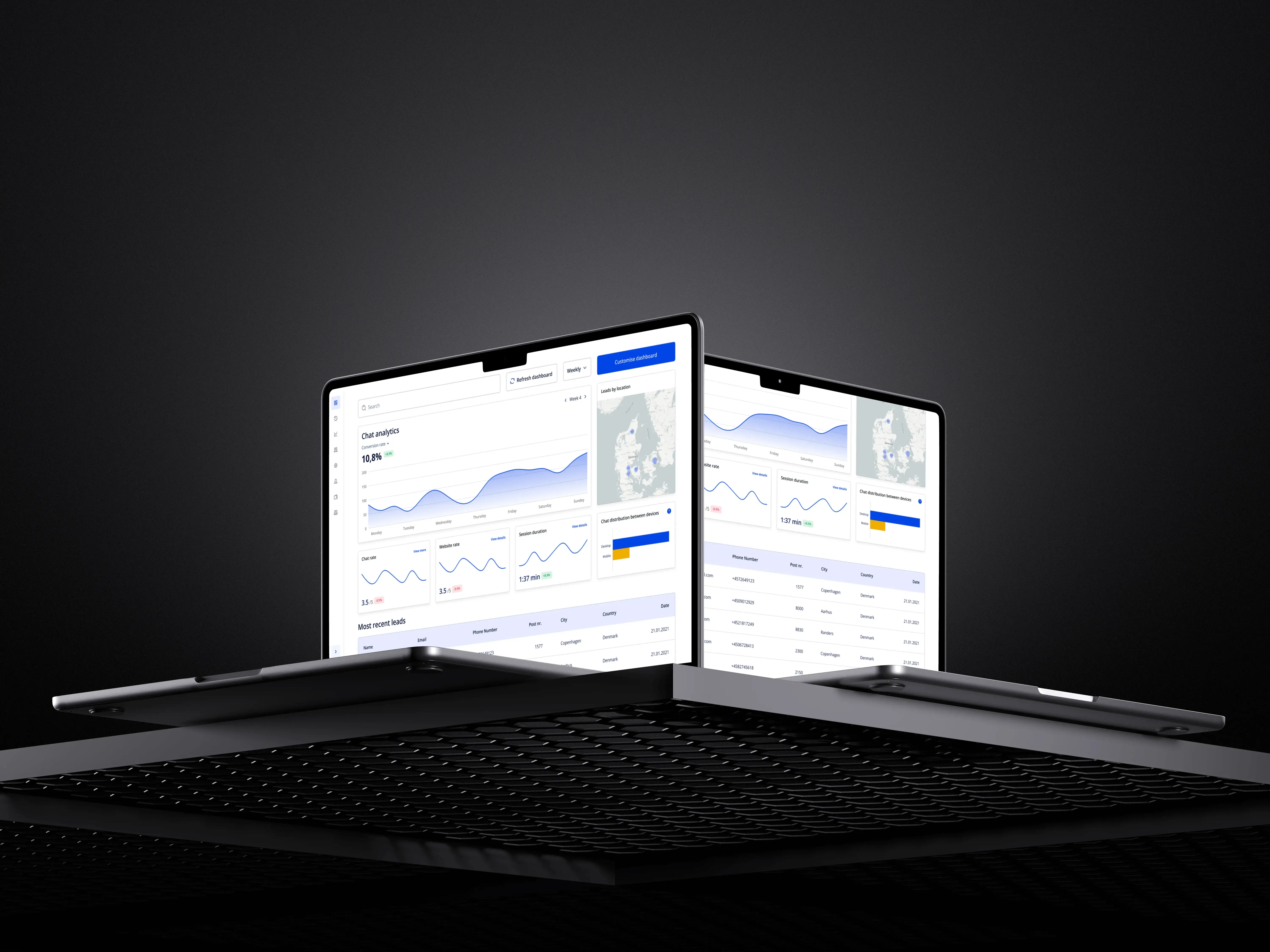
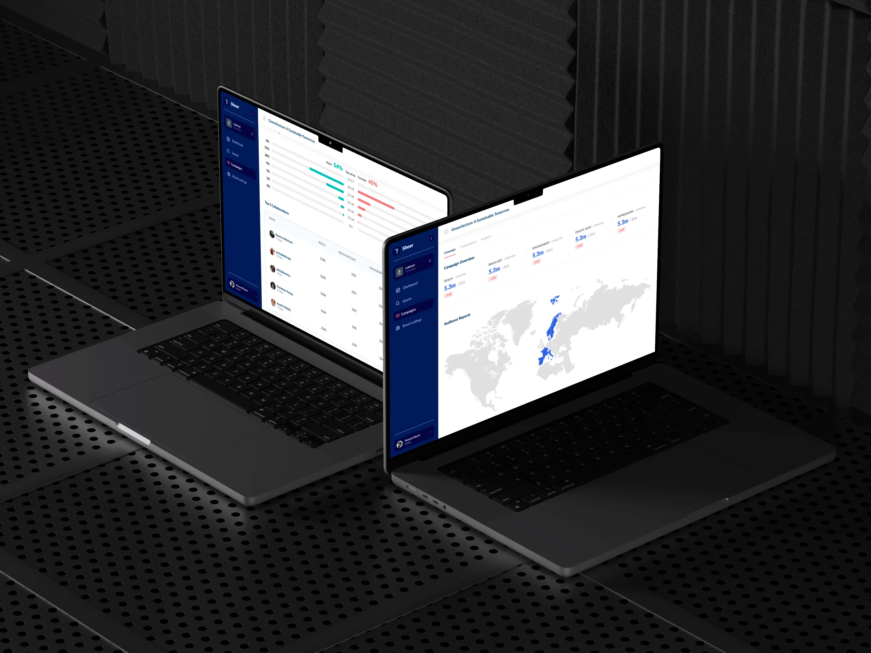
The product is the back‑office platform that sits behind the company's payment gateway, and it serves two very different audiences. Internal teams use it every day to onboard and configure merchants, monitor transactions, manage risk and disputes, and prepare reports for finance and account management. Merchants log in to the same platform to follow their payments, issue refunds, take manual payments and download the reports they need to reconcile their business.
For roughly 15 years, the platform grew without a designer ever being involved. Features were added by engineers one at a time as the business needed them, which kept it powerful but made it increasingly hard to learn, navigate and extend, for experienced staff and new merchants alike. The redesign was never just a visual refresh: the goal was to rethink how the platform is structured, how well it serves each audience, and how quickly new work can be built on top of it.
MY ROLE
As a Senior Designer at StanVision, a UI/UX and Webflow design agency, I was the only designer on the project and owned it end to end, from the first stakeholder interview to the final design system handed over to development.
The process began with stakeholder interviews and a UX audit of the existing platform, which uncovered the holes and irregularities that 15 years of unplanned growth had left behind. Based on these findings, I proposed a new information architecture and aligned it with the stakeholders before designing any screens. Wireframes were then created in batches, with each batch presented, discussed and refined based on feedback, and the high‑fidelity designs went through several more rounds of the same.
Every presentation also doubled as an interview with the heads of each department. Hearing directly from every team kept the business aligned throughout and ensured the new platform works well for most of the teams who use it, rather than being optimised for one group at the expense of the others.

TRANSACTIONS
Transactions are the heart of the platform. Internal teams and merchants alike need to find a specific payment quickly, understand exactly what happened to it, and take the next step, whether that means issuing a refund, looking into a decline or following a payment through to settlement.
The redesign turns long, dense lists into a clear, searchable view where statuses can be read at a glance and each transaction opens into a structured detail view with its full history. When a merchant is waiting for an answer or a payment needs attention, the information is designed to be a few clicks away instead of spread across several screens.
MERCHANT CONFIGURATION
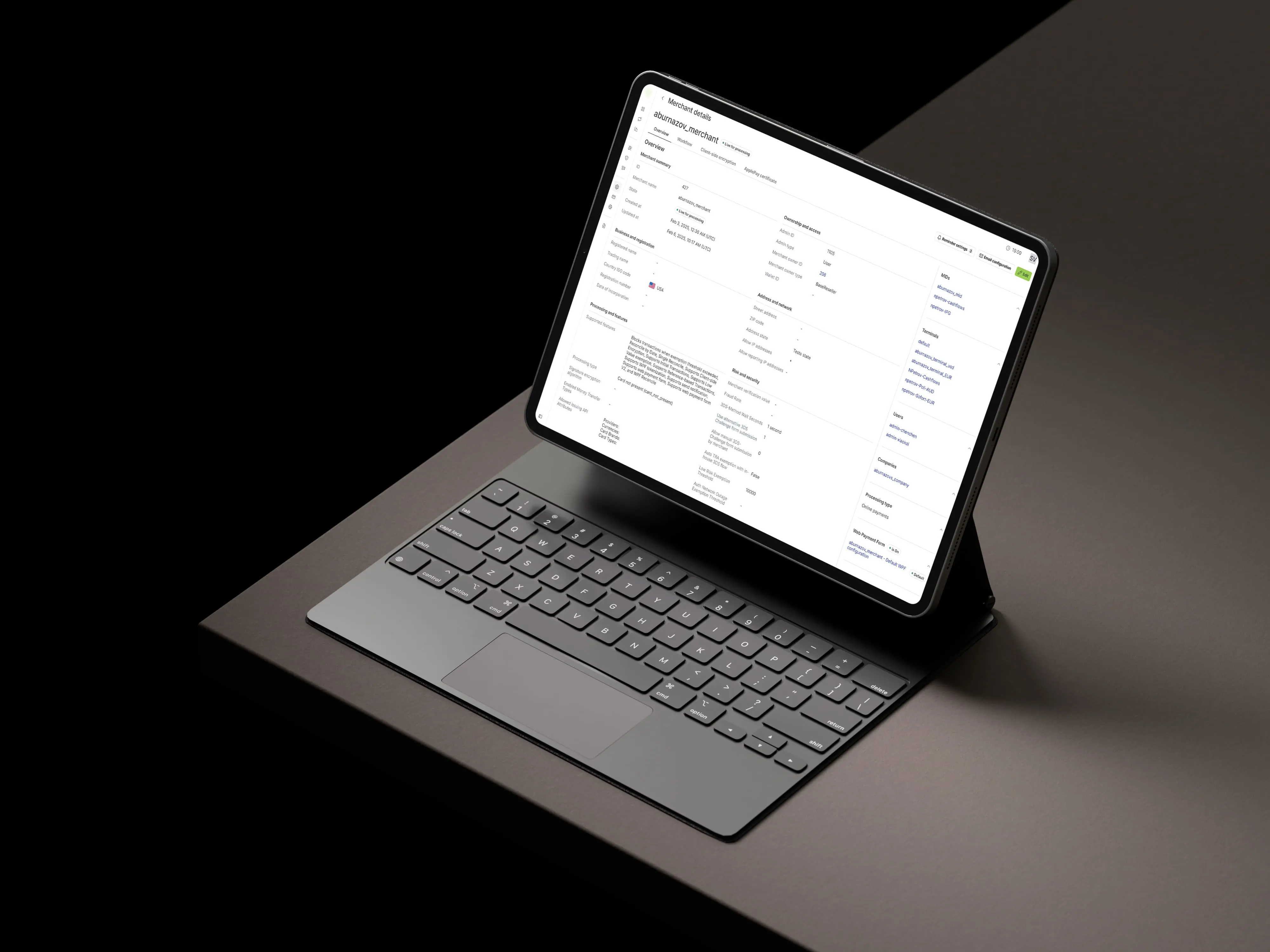
Before a merchant can accept a single payment, their account has to be set up correctly, from merchant IDs and terminals to the payment methods and currencies they offer. These settings also need to stay up to date as the merchant grows into new markets.
Configuration is where small mistakes can have big consequences, so the redesign groups related settings around each merchant and makes the current state of an account easy to review before anything goes live. This is designed to make onboarding faster for internal teams and to help prevent errors that could affect live payments.
RISK & DISPUTESR
Fraud and chargebacks are a constant reality in payments, and handling them is time‑sensitive. Internal teams need to spot unusual activity, review flagged transactions and respond to disputes before deadlines pass, while merchants need a clear view of any chargebacks affecting their business.
The redesign brings cases, statuses and deadlines to the front, so the most urgent items are always the most visible. By making risk information easier to read and act on, the platform is designed to help teams respond faster and with more confidence when money is on the line.

REPORTING & RECONCILIATION
Finance teams and merchants rely on reports to understand volumes, fees, settlements and payouts, and to reconcile what was processed with what actually arrived in the bank.
The redesign makes reports easier to find, configure and export, with consistent layouts across every report type. This is designed to save time on routine month‑end work and to give both the company and its merchants a clearer picture of their payment performance.
DESIGN SYSTEM
To make the redesign sustainable, a design system was built alongside the final designs. It defines shared foundations such as colour, typography and spacing, together with a library of reusable components and patterns, from data tables and filters to forms and status indicators, that developers implement once and reuse across every module.
For a platform this large, serving both internal teams and merchants, the design system is what turns a redesign into something that can actually be delivered. Developers build from ready‑made, documented components instead of interpreting one‑off screens, and the product stays consistent as new features are added.
IMPACT
The new designs are currently being implemented, so product metrics are still to come. The earliest measurable result is on the delivery side: with the design system in place, the overall delivery timeline is around 34% shorter.
Beyond the numbers, the project gave the company the first designer‑led version of a platform that had gone 15 years without one, a structure agreed across departments, and a shared design language the team can keep building on for years to come.

Overview
The client is a long‑established global payment service provider and acquirer. It helps medium and large businesses accept payments online, on mobile, in store and over the phone, across industries such as e‑commerce, travel, gaming, subscription services and financial services. Through a single integration, merchants get access to global acquiring, dozens of global and local payment methods, fraud and risk management, and detailed reporting. In a market where every declined payment, delayed payout or unresolved dispute costs real money, the speed and accuracy of the teams working behind the scenes matter just as much as the technology itself.
Client
Stav Vision
Year
2025
Services
Web App Design, SaaS
ABOUT THE PRODUCT
The product is the back‑office platform that sits behind the company's payment gateway, and it serves two very different audiences. Internal teams use it every day to onboard and configure merchants, monitor transactions, manage risk and disputes, and prepare reports for finance and account management. Merchants log in to the same platform to follow their payments, issue refunds, take manual payments and download the reports they need to reconcile their business.
For roughly 15 years, the platform grew without a designer ever being involved. Features were added by engineers one at a time as the business needed them, which kept it powerful but made it increasingly hard to learn, navigate and extend, for experienced staff and new merchants alike. The redesign was never just a visual refresh: the goal was to rethink how the platform is structured, how well it serves each audience, and how quickly new work can be built on top of it.
MY ROLE
As a Senior Designer at StanVision, a UI/UX and Webflow design agency, I was the only designer on the project and owned it end to end, from the first stakeholder interview to the final design system handed over to development.
The process began with stakeholder interviews and a UX audit of the existing platform, which uncovered the holes and irregularities that 15 years of unplanned growth had left behind. Based on these findings, I proposed a new information architecture and aligned it with the stakeholders before designing any screens. Wireframes were then created in batches, with each batch presented, discussed and refined based on feedback, and the high‑fidelity designs went through several more rounds of the same.
Every presentation also doubled as an interview with the heads of each department. Hearing directly from every team kept the business aligned throughout and ensured the new platform works well for most of the teams who use it, rather than being optimised for one group at the expense of the others.
TRANSACTIONS
Transactions are the heart of the platform. Internal teams and merchants alike need to find a specific payment quickly, understand exactly what happened to it, and take the next step, whether that means issuing a refund, looking into a decline or following a payment through to settlement.
The redesign turns long, dense lists into a clear, searchable view where statuses can be read at a glance and each transaction opens into a structured detail view with its full history. When a merchant is waiting for an answer or a payment needs attention, the information is designed to be a few clicks away instead of spread across several screens.
MERCHANT CONFIGURATION
Before a merchant can accept a single payment, their account has to be set up correctly, from merchant IDs and terminals to the payment methods and currencies they offer. These settings also need to stay up to date as the merchant grows into new markets.
Configuration is where small mistakes can have big consequences, so the redesign groups related settings around each merchant and makes the current state of an account easy to review before anything goes live. This is designed to make onboarding faster for internal teams and to help prevent errors that could affect live payments.
RISK & DISPUTESR
Fraud and chargebacks are a constant reality in payments, and handling them is time‑sensitive. Internal teams need to spot unusual activity, review flagged transactions and respond to disputes before deadlines pass, while merchants need a clear view of any chargebacks affecting their business.
The redesign brings cases, statuses and deadlines to the front, so the most urgent items are always the most visible. By making risk information easier to read and act on, the platform is designed to help teams respond faster and with more confidence when money is on the line.
REPORTING & RECONCILIATION
Finance teams and merchants rely on reports to understand volumes, fees, settlements and payouts, and to reconcile what was processed with what actually arrived in the bank.
The redesign makes reports easier to find, configure and export, with consistent layouts across every report type. This is designed to save time on routine month‑end work and to give both the company and its merchants a clearer picture of their payment performance.
DESIGN SYSTEM
To make the redesign sustainable, a design system was built alongside the final designs. It defines shared foundations such as colour, typography and spacing, together with a library of reusable components and patterns, from data tables and filters to forms and status indicators, that developers implement once and reuse across every module.
For a platform this large, serving both internal teams and merchants, the design system is what turns a redesign into something that can actually be delivered. Developers build from ready‑made, documented components instead of interpreting one‑off screens, and the product stays consistent as new features are added.
IMPACT
The new designs are currently being implemented, so product metrics are still to come. The earliest measurable result is on the delivery side: with the design system in place, the overall delivery timeline is around 34% shorter.
Beyond the numbers, the project gave the company the first designer‑led version of a platform that had gone 15 years without one, a structure agreed across departments, and a shared design language the team can keep building on for years to come.